Earthy Milk Brand
Spring-Fall 2023
Client: Student Project
Challenge: To create various advertisements for a product or service.
Description: For this project, it started out as just creating a responsive design for a product or service. As a result, I made my own quirky milk brand named Earthy, focusing on its weird plant-based flavors like dirt to evoke discomfort in the audience. It’s slogan is “nourish me naturally.” I aimed to make the brand friendly and approachable to make the product seem normal at first glance and concern those with keen eyes. Designing various advertisements, such as a responsive web design and social media posts, let me practice keeping the overall tone and look consistent to the brand identity.
Visual Research
Before designing this, I got inspired greatly by another design project called Planty by Marka Network. I also looked at other brands that advertise healthy and organic goods and products, along with other existing milk brands.
Branding Identity
Here are the various logos for the brand. The crossbar on the letters were lowered and in line with each other. Some of them were curved to give it more flow. The “Y” was replaced by a plant to give the idea that the product is plant-based. For the colors, neutral earth tones were used to further emphasize the idea that it’s healthy and organic. To make it approachable and friendly, various sans-serif fonts were chosen.
Lockup
Wordmark
Logomark
Color Palette
Packaging and Mockups
These are some mockups of what Earthy Milk would look like as a physical product. It’s a simple design that is color coordinating according to the specific flavor of milk. Underneath is the inverted pattern of the pattern from the packaging and the color palette of the packaging.
Responsive Web Design
For this specific project for the brand, we had to create a responsive design and website layout. Additionally, there are mockups of the different compositions going from desktop, tablet, and smart phone.
Desktop
Tablet
Smart Phone
Mockups of Each Device
Figma prototype of the desktop view.
Earthy and Meaty Milk Social Media Ads
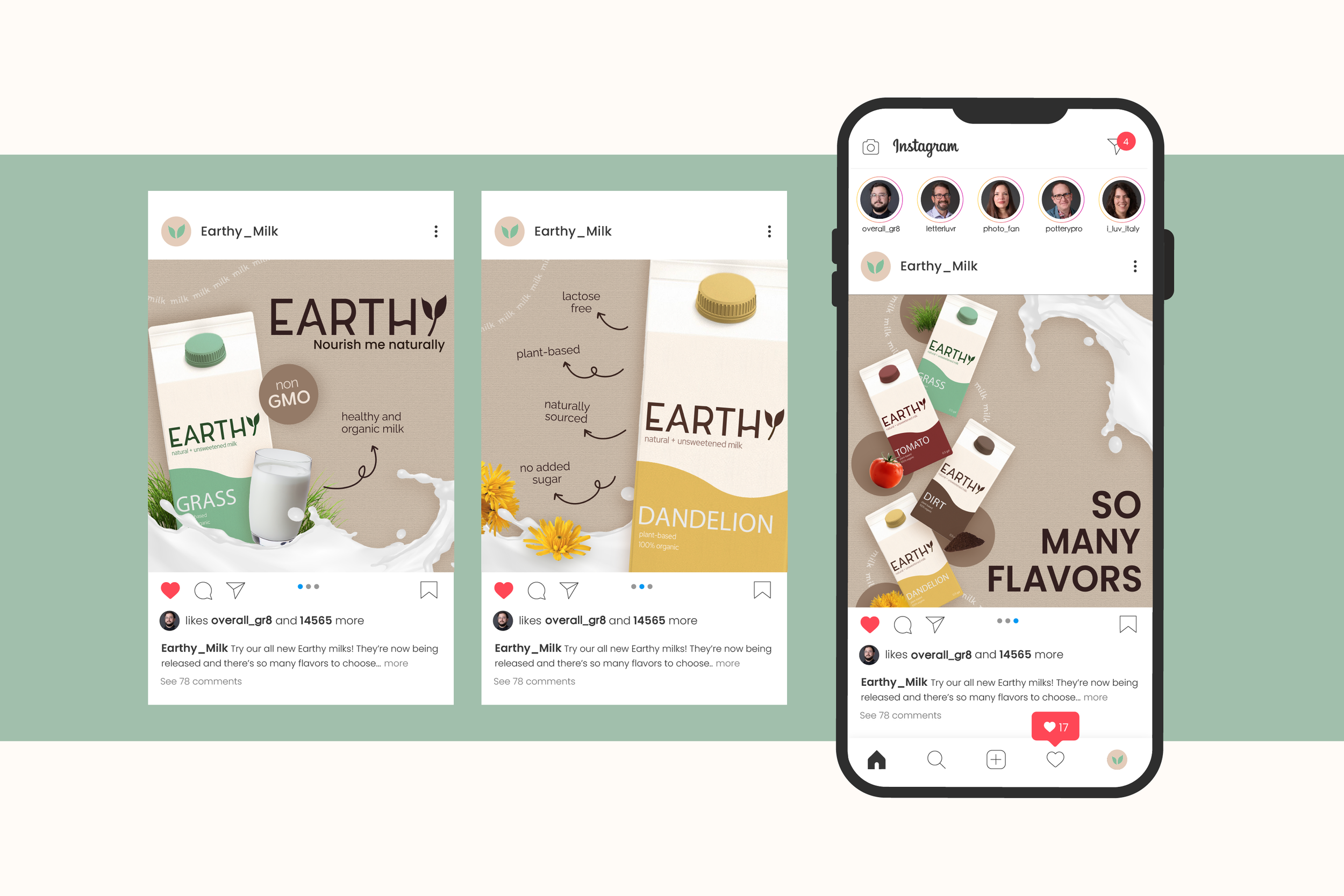
This project included creating a set of social media ads and having to make each one go hand-in-hand. To continue the brand and give it more supporting work, I chose Earthy Milk for this as well. I used lots of the same aspects from the responsive design, such as including the repeated “milk” line in the background. I still created the same approachable and friendly look by using the neutral colors and sans-serif fonts.
After creating the first set of social media ads, we were prompted to create the same product but with an entirely opposite feel. Instead of a neutral and healthy product, Earthy Milk turned into Meaty Milk. Meaty Milk is a Slim Jim flavored milk that is processed meat and genetically modified. The packaging stays relative the same as its original but was changed to a straight diagonal, mimicking Slim Jim’s design.
Wordmark
Logomark
Color Palette
Both sets of social media ads match the look and general idea of the brand. It was fun to play around with an already weird product, making it even more quirky and disturbing. Along with that, it was really interesting to see how much the general identity of a product can change with the certain usage of colors and font types.


