Bean Buddies Branding Identity
Fall 2023
Client: Student Project
Challenge: To create a fictional restaurant brand and design everything ranging from the logo to the collateral.
Description: For this project, I wanted to design a delightful and memorable coffee shop by giving it cute and playful elements, thus making "Bean Buddies." The shop featured five charming bean characters, each brimming with its own distinct personality, adding a whimsical touch for customers to enjoy. The project involved extensive branding, exploration of product design, and collateral creation. Throughout the project, I faced challenges in avoiding repetition in mockups. However, this prompted me to consider how customers would interact with the collateral in person, leading to thoughtful design decisions aimed at enhancing the overall experience.
Visual Research
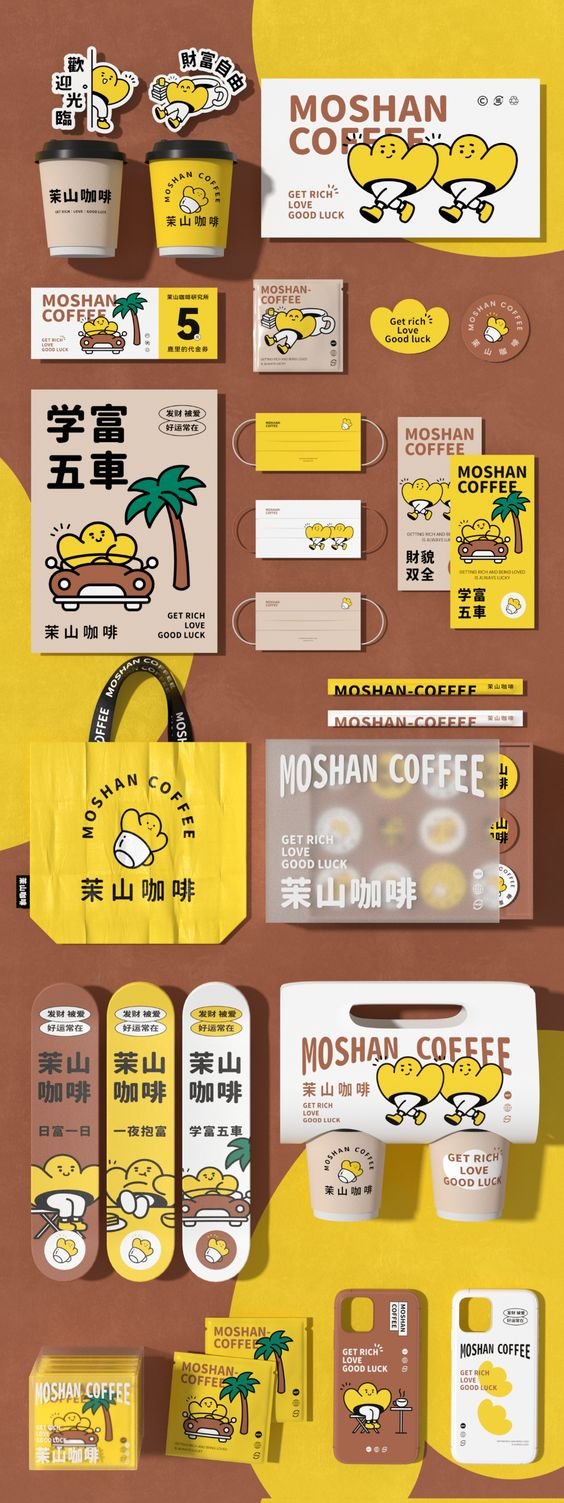
My first thought when making this coffee shop was to make it cute, friendly, and warm. I wanted to also make little bean characters to add to its charm and make it more memorable. Before designing, I began to research other existing brands and projects to get inspiration and see what choices they made, mainly looking at simple but fun Japanese and Korean cafes. I imagined this cafe to be somewhere downtown in a smaller city and targeted towards teens and young adults.
Initial Sketches & Conceptualization
I knew that I wanted the logo to be round and friendly in order to invite people in. I also knew that I wanted to incorporate the Bean Buddies in some aspect and decided to have one be the main mascot of the cafe.
Identity Package
This section includes the basic overall brand information. It has the various different logotypes, color palette, specific fonts, and the bios of each of the Bean Buddies.
Lockup
Wordmark
Logomark
Color Palette
Typefaces
Bean Profiles
Collateral & Lots of Mockups
This project consisted of a lot of branding and collateral for the Bean Buddies. The main business system has a menu, pattern, letterhead, logos, envelope, and business card. The rest is making collateral to go along with it and make everything feel more real. It includes an apron, storefront, coffee cart, billboard, Instagram ad, guest booklet, receipt, coffee cups, cupholders, coasters, pens, and a sandwich sign. I began to have some difficulties during the middle of doing mockups as it started to feel repetitive. However, it made me begin to think about different ways customers would see and handle the collateral in person, making the overall design more considered.
Business card, envelope, and letterhead
Menu
Apron
Reciept
Coffee Cups
Cupholder
Guest Booklet
Pens
Billboard
Coasters
Instagram Advertisement
Storefront
Sandwich Board
Pattern
Coffee Cart
Branding Style Guidelines
For this part of the project, it was time to put everything together. To make it more easily digestible, we had to make a style guide that explained the basic rules when using any of the branding material. It consists of aspects such as logotypes, color palettes, typography, collateral, etc. It contains background information for each buddy, profiles, colors, and don’ts.
Guideline Highlights
Overall, this project was very challenging but rewarding in the end. It was successful in portraying each of the personalities of the Bean Buddies, making them each unique and memorable to better the overall customer experience. I learned a lot more about the general formatting of style guidelines and what can be included within it. This guide was created to help establish clear rules of how to use everything, ranging from logotypes to typography. It has many successes, especially with the additional illustrative elements throughout the guide to make it more playful. With everything now together in one consistent guide, it’s satisfying to see how everything comes together to communicate a brand identity. The project provided me with lots of new experience and insight into the intricate process of making a cohesive and engaging brand identity.


